

A product can be well made and still lose the sale on the shelf. If the label looks cheap, peels at the edges, smudges in storage, or feels off-brand, customers notice fast. That is why custom product label printing matters for small businesses, retailers, food brands, cosmetic lines, and event-based sellers trying to present products professionally without wasting budget.
Labels do more than identify a product. They carry your brand, organize product lines, support compliance details, and help packaging look finished. For many businesses, the label is the first printed item a customer touches. That makes material choice, print quality, finish, and adhesive performance part of the buying decision, not just decoration.
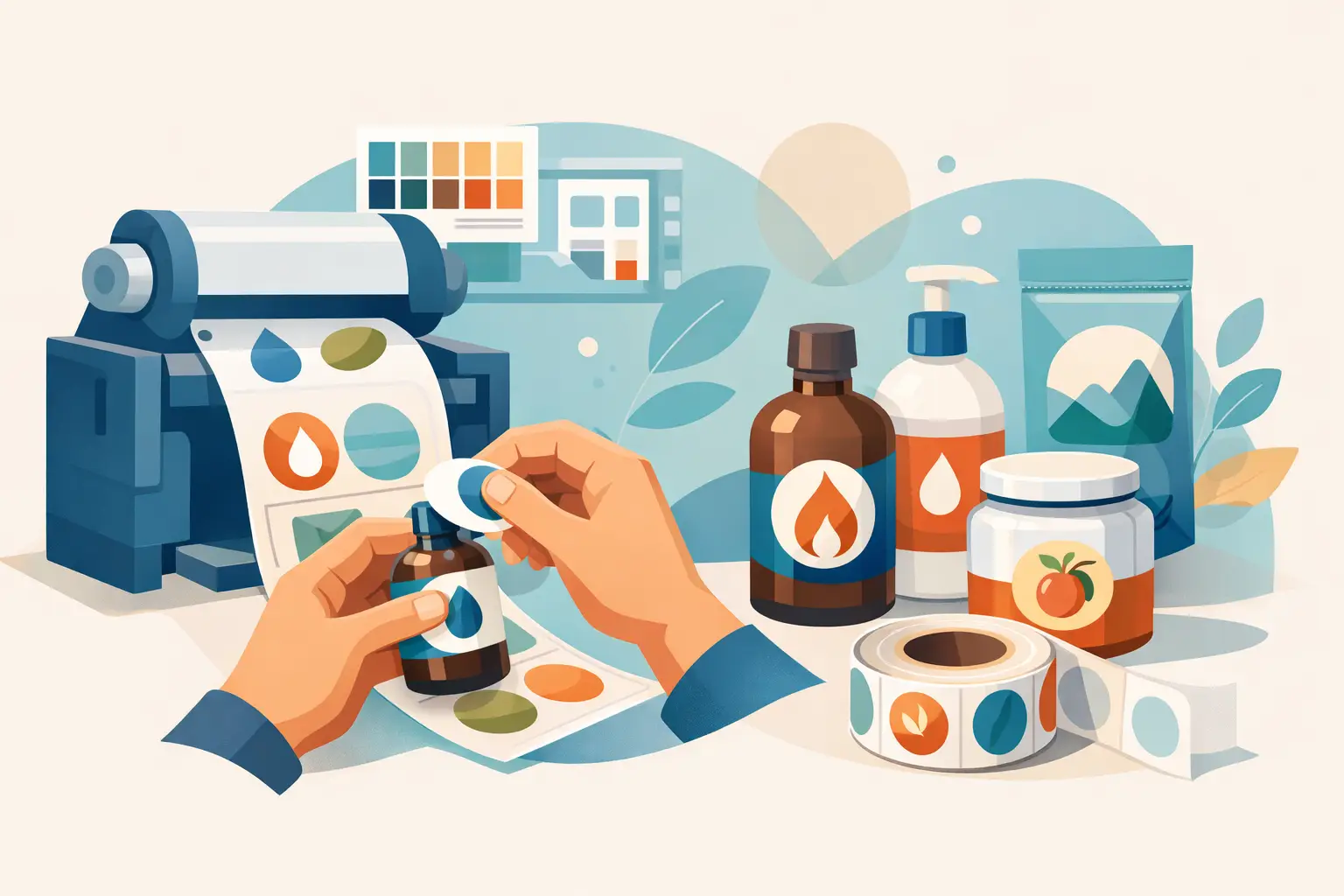
What custom product label printing needs to do
The right label has to fit the package, match the product environment, and stay readable through handling. A candle jar label has different demands than a chilled beverage sticker, and a short-run promo label has different priorities than a retail label used every week. Good custom product label printing starts with that basic question – what does this label need to survive?
For dry goods, paper labels can work well and keep costs under control. For bottles, refrigerated items, bath products, or anything exposed to moisture or oil, a more durable stock is usually the safer choice. If the product sits under bright retail lighting or gets moved through warehouses, fading and scuffing also become practical concerns.
The visual side matters too. Some brands need a clean matte finish for a premium look. Others need gloss for strong color pop. A children’s product may benefit from bright, playful label graphics, while a coffee brand may need muted tones and textured finishes that feel more upscale. There is no universal best option. There is only the best fit for the item, the budget, and the sales channel.
Choosing the right label stock and finish
Label material affects both appearance and performance. Paper stock is often the entry point for many businesses because it is cost-effective and works well for cartons, boxes, dry packaging, and short-term applications. It prints cleanly, supports strong color, and suits many standard retail uses.
Film and synthetic options make more sense when durability matters. These materials resist water better, hold up under friction, and are often better for bottles, jars, refrigerated products, personal care items, and takeaway packaging. If your products go from storage to shelf to customer handling, durability is not an upgrade. It is part of the specification.
Finish changes how the label presents the product. Gloss adds shine and can make colors look more vivid, which works well for beverages, promotional packaging, and high-contrast designs. Matte creates a flatter, more refined look and often suits premium food, cosmetics, and minimalist branding. Lamination adds another level of protection, especially where labels may rub against each other in transit.
For brands trying to create a higher-end impression, specialty effects can help, but only if they fit the product price point. Spot UV, foil accents, embossing, or custom die-cut shapes can make packaging stand out, but they also add cost and may not be necessary for every SKU. If you are labeling a limited-edition product or a flagship line, those upgrades may be worth it. If you are printing high-volume labels for fast-turn retail items, consistency and price control may matter more.
Size, shape, and application matter more than most buyers expect
One common mistake is choosing label dimensions based only on artwork rather than package geometry. A label that looks balanced on screen may wrap awkwardly around a tapering bottle or crease on a curved lid. Before placing a production order, it helps to confirm the flat application area, corner radius, and any seams or contours that could affect placement.
Shape also affects usability. Rectangles and squares are efficient, easy to align, and often the most economical. Circles and ovals work well for lids, seals, and decorative product labeling. Die-cut custom shapes can create stronger shelf presence, especially for gift packaging, seasonal items, or products sold in crowded categories, but they require more planning.
Application method matters too. If staff are applying labels by hand, overly large labels or complex shapes can slow packing and increase waste. If labels need to line up exactly on every unit, a practical shape with forgiving placement can reduce production errors. For growing businesses, that kind of detail has a direct labor cost.
Design for print, not just for screen
A label file that looks sharp on a phone does not always print well at actual size. Small text, low-contrast color combinations, and thin lines can all create problems once the label is reduced and applied to a package. Product names, variant details, ingredients, usage instructions, and barcode areas need enough space to remain clear.
This is where many first-time buyers overbuild the design. They try to fit too much onto a small label and end up with cluttered packaging. A better approach is to decide what the customer needs to see first, what is required for operations or compliance, and what can move elsewhere on the box or insert.
Color choice should also be practical. Deep blacks, rich brand colors, and photo-heavy graphics may look strong, but print result depends on stock, finish, and file setup. Matte surfaces can mute some colors. Gloss can intensify them. If matching existing brand materials such as cartons, business cards, flyers, or display signage, consistency should be planned from the start.
Short runs vs repeat orders
Not every business needs large-volume label production on day one. Startups, seasonal sellers, event vendors, and test-market brands often benefit from shorter runs. This keeps inventory flexible and avoids holding outdated packaging if ingredients, sizing, pricing, or branding changes.
On the other hand, repeat products with stable packaging usually benefit from standardized reorders. Once the stock, finish, adhesive, and dimensions are working well, keeping that specification consistent saves time and reduces errors. Businesses ordering labels regularly should treat label specs the same way they treat invoice books, menus, stickers, or business cards – as repeat operational print, not one-off artwork.
That is where buying from a supplier with a broad print catalog can simplify procurement. If you are already ordering packaging inserts, product stickers, promotional cards, uniforms, or event signage, keeping those items with one vendor can make brand consistency and reorder management easier. For businesses with recurring print demand, convenience is not a small benefit. It affects turnaround, coordination, and purchasing time.
Common buying mistakes in custom product label printing
The most expensive label problems usually start before printing. Buyers choose the lowest-cost stock without considering moisture or friction. They approve artwork with text too small to read. They skip finish options that would protect the label during handling. Or they order a shape that looks impressive but applies poorly in real packing conditions.
Another issue is treating all products the same. A bakery box label, a sauce bottle label, and a cosmetic jar label should not automatically use the same material just because the branding matches. Product environment, storage, and handling all affect performance. Matching the look is easy. Matching the use case is the real requirement.
There is also the problem of underordering or overordering. Very small runs can raise unit cost, while oversized runs create waste if product information changes. The right quantity depends on how often you restock, how stable your design is, and whether your label is part of a product launch, a seasonal push, or a long-term line.
How to order labels that work for your business
The fastest path to a usable result is to define the basics clearly before comparing options. Know the package size, the surface the label will stick to, the storage conditions, the quantity, and the finish you want customers to see. If the product line includes multiple variants, think about whether you need one standardized layout with color changes or fully separate label designs.
It also helps to think beyond the label itself. If your product is sold at markets, retail counters, events, or through shipping boxes, your packaging may need matching supporting print such as hang tags, flyers, inserts, window decals, countertop signs, or promotional merchandise. Brands usually look more established when those pieces feel coordinated.
Seaonce serves buyers who need that wider range – not just labels, but the surrounding print materials that help products sell in stores, at events, and through everyday business operations.
If your label has one job, it should do it well: stay on, read clearly, and make the product look ready to buy. Start with the product, choose specs that match real use, and let the print do the work.