

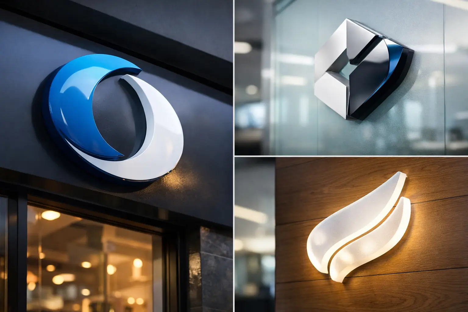
A flat printed sign can share information. A well-made acrylic sign gives that information a physical presence. For reception walls, retail counters, salon interiors, restaurant entrances, office corridors, and showroom displays, 3d acrylic signboards create a clean, dimensional finish that looks more permanent than a poster or vinyl graphic.
They are a practical choice when your business needs branding that customers can see immediately, from a distance and up close. The right combination of acrylic thickness, letter style, color, and mounting method can make a small logo look premium or help a larger wall display become a focal point.
What Makes Acrylic Signboards Look 3D?
The 3D effect comes from raised acrylic elements rather than ink alone. Individual letters, logos, icons, or shapes are cut from acrylic sheets and mounted onto a wall, backing panel, or sign base. The material projects outward, creating visible depth and a natural shadow line around the design.
Acrylic is smooth, rigid, and available in a wide range of colors and finishes. Clear acrylic is commonly used for modern office signs, while black, white, red, blue, gold, silver, or custom-color acrylic can match a brand palette. Depending on the application, a printed vinyl layer, UV print, or additional acrylic layer can be used to add colors, gradients, fine details, and visual contrast.
This construction is why acrylic performs particularly well for logos with bold typography, simple icons, and strong color blocks. Fine text can be produced, but it needs enough stroke width to remain readable and durable after cutting and installation.
Where 3D Acrylic Signboards Work Best
Acrylic signage is suitable for businesses that want a polished interior display without moving into the cost range of fabricated metal or illuminated channel letters. It is commonly ordered for reception branding, room labels, directional signs, product displays, menu features, and event backdrops.
For a retail shop, raised logo letters behind the checkout counter give the space a more established look. For a clinic, agency, or corporate office, a clear acrylic panel with raised lettering can identify the reception area without making the wall feel crowded. Restaurants and cafes can use acrylic lettering for feature walls, ordering areas, or menu headings, especially where the interior design already includes wood, tile, concrete, or painted surfaces.
They also work well for temporary-to-medium-term installations such as exhibitions, launches, pop-up stores, and conferences. In these cases, the sign needs to look professional but may not require the long service life or engineering of exterior metal signage.
Choose the Right Acrylic Material and Finish
Material choice affects both appearance and budget. Standard colored acrylic is a dependable option for high-contrast lettering and logos. It produces a clean, solid face and is often the most direct choice for indoor branded walls.
Clear acrylic gives a lighter, more architectural look. It can be mounted with standoffs or fixed directly to a surface, then printed or layered with opaque letters. This option suits offices, salons, studios, and premium retail spaces where the wall color should remain visible behind the sign.
Gloss acrylic reflects more light and produces a sharper, more polished finish. It works well in spaces with controlled lighting and modern interiors. Matte or frosted acrylic reduces glare and fingerprints, making it useful for areas with strong overhead lights or frequent customer contact.
Mirrored gold and silver acrylic can add a premium accent to a logo or headline. Use it selectively. A full mirrored sign may look impressive in a boutique, beauty brand, or hospitality setting, but it can be harder to read under mixed lighting. Combining mirror acrylic with solid black, white, or brand-color letters often gives a better balance.
Thickness matters too. Thin acrylic can be suitable for small labels and lightweight decorative elements. Thicker material creates stronger shadow depth and a more substantial appearance on a reception wall. Larger letters generally benefit from thicker acrylic, especially when viewed from several feet away.
Design for Readability Before Decoration
The best sign is not always the one with the most effects. A logo should be recognizable within a few seconds, and a visitor should be able to read the business name without standing directly in front of it.
Start with the installation wall. A dark logo on a dark wall may disappear, while a clear acrylic panel can lose impact on a busy patterned surface. If the wall is textured, uneven, or heavily grooved, a backing board may be needed to provide a clean mounting area.
Contrast should guide the final color selection. White acrylic letters stand out on charcoal, navy, wood, or brick backgrounds. Black letters work well on pale painted walls and light stone. If brand colors do not provide enough contrast, use them in a secondary element such as an icon, outline, or colored backing layer.
Avoid using very thin fonts, excessive script lettering, or tiny decorative details in a large wall sign. Those details may look good on a screen but can become difficult to cut, mount, and read. A simple logo with clear spacing usually produces the strongest result.
Prepare Artwork That Prints and Cuts Cleanly
Vector artwork is preferred for acrylic sign production. Files such as AI, EPS, SVG, or print-ready PDF allow letters and shapes to be cut accurately at the required size. High-resolution PNG or JPG files can be useful for reference, but they may not be suitable for precise cutting, especially if the logo has fine edges.
Before approving production, check the spelling, letter spacing, colors, and dimensions. Confirm whether the sign includes only raised letters or a full acrylic panel with printed graphics. These are different products with different visual results.
If your design uses multiple colors, ask whether each color will be cut as a separate acrylic layer or printed onto the material. Layered acrylic creates more physical depth. Printed acrylic allows finer artwork, gradients, photographs, and complex color transitions. The right option depends on the logo and the viewing distance.
Mounting Options Affect the Final Look
Mounting is not an afterthought. It determines how far the sign sits from the wall, how clean the installation appears, and whether it can be removed later.
Direct adhesive mounting is often used for individual acrylic letters and logos. It creates a close-to-wall finish and keeps the focus on the raised design. This is suitable for smooth painted walls, glass, laminate, and other clean surfaces. Installation requires careful alignment, usually with a placement template, because repositioning can be difficult once the adhesive is fixed.
Standoff mounting uses visible metal or acrylic spacers to hold a panel away from the wall. It adds another level of depth and is often selected for office directories, reception plaques, opening-hour signs, and branded information panels. Standoffs are especially useful when you want a sign that can be updated or removed with less damage to the wall.
A backing panel is another practical option. The raised acrylic logo can be mounted onto PVC, ACP, wood-look board, or another rigid base before the complete sign is fixed to the wall. This method is useful when the installation surface is uneven or when the sign needs its own defined shape.
For exterior use, the sign needs more consideration. Acrylic can be used outdoors, but prolonged sun exposure, rain, heat, and mounting conditions affect performance. Choose suitable material, weather-resistant fixing, and a location with realistic expectations for service life. For high-exposure storefront signage, ACP, metal fabrication, or illuminated signage may be a better fit.
Size Your Sign for the Viewing Distance
A sign that looks large on a desktop preview may appear undersized once installed on a wide wall. Measure the available wall area, then consider where customers will first see it. A reception logo viewed from 10 to 15 feet away needs more scale than a door label read at arm’s length.
Leave breathing room around the design. A logo pushed too close to ceiling lines, furniture, wall corners, or lighting fixtures loses impact. For a feature wall, the sign should relate to the full space, not only the empty section immediately behind the desk.
If the design includes a tagline, phone number, social handle, or service list, separate the essential from the optional. The business name and logo should remain the dominant elements. Supporting text can be printed on a panel or applied in smaller vinyl if it does not need the same raised effect.
Ordering Details to Confirm
Before placing an order for 3D acrylic signboards, confirm the finished size in inches, acrylic colors, thickness, number of layers, and mounting method. Share the wall type and indoor or outdoor location if installation guidance is needed.
Also confirm whether the order includes installation or only production. Large logos with many separate letters may require a template for accurate placement. If you are arranging your own installer, request clear marking for each element and keep the layout drawing available during installation.
Acrylic signage is most effective when it supports the rest of your branded materials. Match the logo treatment with your business cards, flyers, menus, packaging, stickers, uniforms, and promotional products so customers see one consistent identity at every touchpoint.
A well-sized acrylic sign does more than fill an empty wall. It tells visitors they have arrived at a business that pays attention to presentation, and that impression starts before the first conversation.