

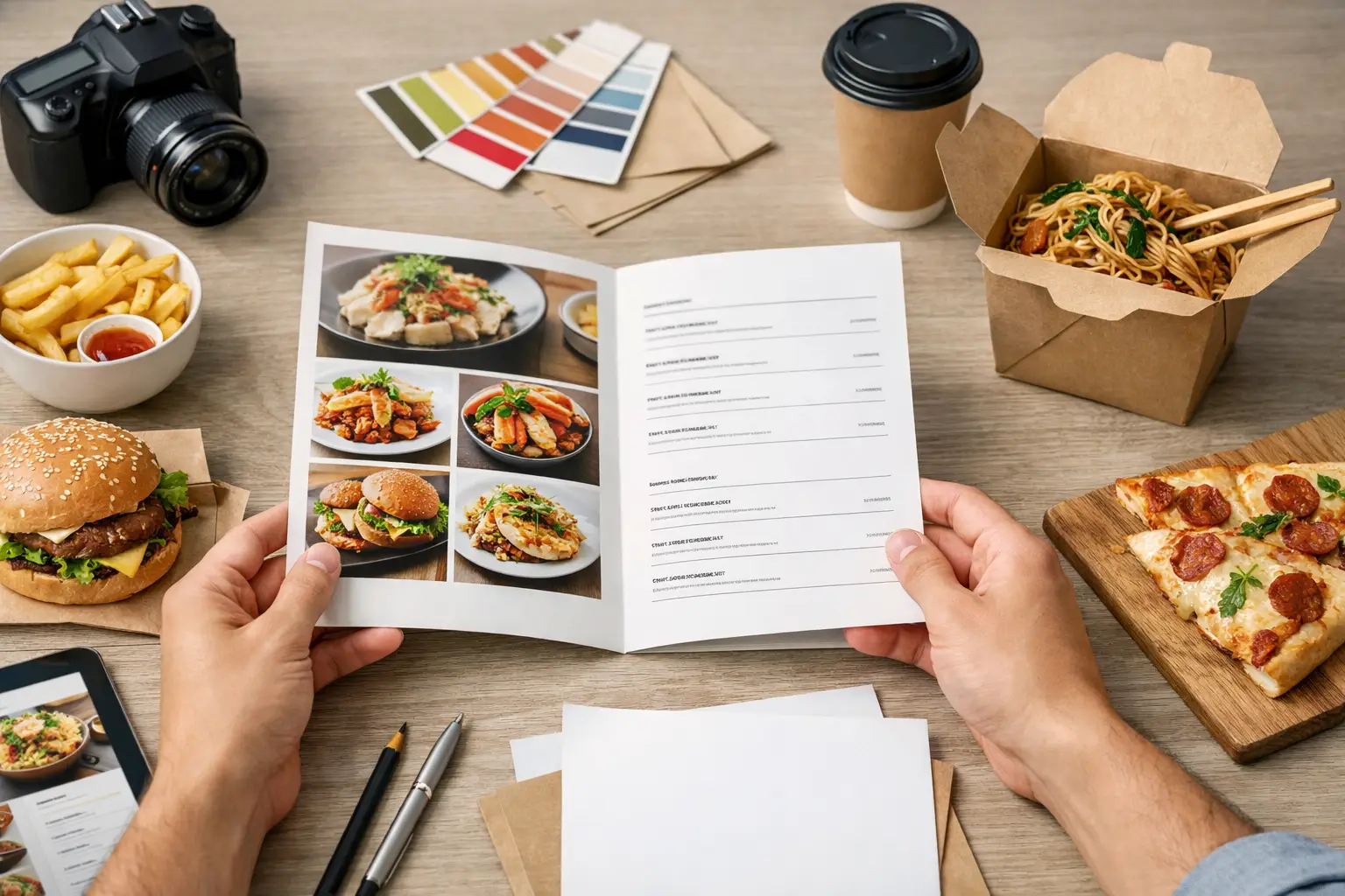
Friday night orders don’t slow down because your food is weak. They slow down because customers can’t scan the menu fast enough, can’t find your best sellers, or give up when the layout feels crowded. If you’re figuring out how to design restaurant takeaway menus, the goal is simple: make ordering quick, clear, and profitable in print and on the counter.
A takeaway menu is not the same as a dine-in menu. It works harder in less time. People read it while standing at the register, holding a phone, passing it around at home, or pulling it out of a kitchen drawer weeks after delivery. That changes the design priorities. You need strong hierarchy, practical sizing, durable stock, and content that supports real buying decisions.
How to design restaurant takeaway menus for faster orders
Start with the format before you touch colors or graphics. A tri-fold flyer gives you more sections and suits large menus with multiple categories. A flat A4 or letter-size sheet is easier for quick-service restaurants with a shorter offer. A folded menu feels more substantial, but extra panels can also hide key items if the flow is poor.
The right size depends on how much you sell and where the menu will be used. If most customers order for delivery and keep the menu at home, a folded format can hold more detail. If your menu is mainly for takeaway counters, hotel lobbies, and bag inserts, a simpler flat piece is often better. More space is not always better space.
Your first design decision should be what must be seen in five seconds. Usually that means your brand name, cuisine type, phone number, QR code if used, ordering hours, and best-selling categories. If those are buried, the menu looks designed but doesn’t function.
Build the layout around customer behavior
Most restaurant owners try to fit everything on one menu because printing more pages feels expensive. The trade-off is readability. A packed menu with tiny type can reduce order value because customers skip over add-ons, house specials, and higher-margin combos.
Group your menu by the way people actually order. Appetizers, mains, sides, drinks, desserts, family meals, and specials are standard for a reason. Avoid clever category names if they slow understanding. A customer should not have to decode where wings, rice bowls, or meal deals belong.
Within each section, lead with the items you most want to sell. That may be your signature dishes, high-margin meals, or products that travel well. Takeaway design is partly visual and partly operational. A dish that looks great on paper but arrives poorly may create repeat-design problems later because it keeps getting promoted but disappoints in delivery.
Use boxes, color blocks, or small callouts sparingly to highlight combos, lunch specials, and family bundles. If everything is highlighted, nothing stands out. One or two promotional zones per panel usually do the job.
Keep the scan path obvious
Good menu design controls eye movement. Customers should move from identity to category to item to price without friction. That means clear section headers, consistent spacing, and prices placed where they are easy to compare.
Don’t mix too many text alignments, font styles, or image treatments. A menu with centered text, left-aligned descriptions, bold all-caps headers, script fonts, and multiple badge styles looks busy even before the customer reads it. Consistency sells clarity.
Make pricing easy to read, not too aggressive
Price presentation affects both speed and perception. If prices are too dominant, customers shop only by cost. If prices are too small or hard to find, ordering slows down and staff spend more time answering basic questions.
A practical approach is to place prices at the end of each item line or directly beneath item names in a consistent pattern. Use the same currency format throughout. If you show some items as $12 and others as 12.00, the page starts to look inconsistent. Clean formatting matters more than decorative styling.
Descriptions should do only enough work to help the sale. For takeaway, customers mainly need to know the core ingredients, protein choice, spice level if relevant, and major add-ons. Long chef-style descriptions waste space. Short, direct copy performs better on print menus.
For example, “Crispy chicken, slaw, pickles, house sauce” is stronger for takeaway than a long paragraph about texture and preparation. It is quicker to scan and easier to fit into tight layouts.
Typography matters more than decoration
If you want to know how to design restaurant takeaway menus that stay readable after print, start with type size. Many menus fail because they look fine on a screen but print too small. Body text usually needs to be comfortably readable at arm’s length, especially under average indoor lighting.
Use one headline font and one body font in most cases. More than that usually creates clutter. Script fonts can work for a logo or a very short accent line, but not for item names, prices, or operating details. Decorative fonts reduce speed, and speed is the point.
Contrast matters too. Light gray text on a beige background may look stylish on a monitor and wash out in print. Black or very dark text on a light background is still the safest option for most food menus. If your brand uses dark backgrounds, test them carefully before committing to a large print run.
Photos: use them selectively
Food photos can increase response, but only if the photography is strong and the menu is not overloaded. One weak, dim, or inconsistent image can make the entire menu look cheap. If you don’t have high-quality photos, a clean typographic menu is better than a badly illustrated one.
Use photos for hero items, combo meals, or signature dishes that need explanation. Avoid adding a photo to every item unless you are running a picture-heavy fast-food format. Too many images reduce space for important text and make the design harder to update when prices change.
Print specs affect the result
A takeaway menu is a print product first. Paper stock, coating, fold type, and finish all affect usability. Thin paper may lower cost, but it can also feel disposable and crease badly. Heavier GSM stock gives a more solid hand feel, especially for folded menus passed around repeatedly.
Gloss coating can make food photos pop, but glare can hurt readability under bright lights. Matte or silk finishes are often easier to read and still present well. If the menu is going into takeaway bags or direct mail drops, choose a stock that can handle handling without looking worn after one use.
Lamination can add durability, but it isn’t always necessary for short-term promotions or frequent seasonal updates. If you change pricing often, it may be smarter to use a standard coated stock and reprint more flexibly than to invest in heavy finishing every time.
This is where working with a supplier that offers multiple sizes, stocks, and finishing options helps. A restaurant with a stable core menu may benefit from a more premium folded piece, while a shop running weekly offers may need a simpler flyer that can be reordered fast.
Don’t forget the operational details
A visually strong menu still fails if the ordering details are incomplete. Include phone number, website or app prompt if applicable, business hours, address, service zones if limited, and any ordering conditions that reduce confusion. If you charge for extras, show that clearly. If combo upgrades are available, make them easy to spot.
If your menu includes delivery and pickup, say so plainly. If certain items are pickup only or available after a specific time, mark them without clutter. Customers don’t mind restrictions as much as they mind surprises.
Allergen notes, spice indicators, and combo rules should be visible but not overpowering. Use small icon systems only if they are obvious. If the symbols need a legend that takes up half a panel, the system is too complicated.
Test before you print in volume
Before placing a full order, print a sample at actual size. Hand it to staff and regular customers. Ask them to find a combo meal, a vegetarian item, a family option, and your phone number. If they hesitate, the layout needs work.
Also check practical issues: Are fold lines cutting through prices? Are photos too dark? Does the red you chose make black text harder to read? Does the menu still work if a customer sees only the front panel first? These are small issues on screen and expensive issues after production.
If you are ordering professionally printed menus, prepare files with proper bleed, image resolution, and color settings. That reduces delays and helps the final piece match expectations. Commercial print is not just about design taste. It is about output quality and repeatability.
A takeaway menu should help your staff sell, help your customers decide fast, and hold up well enough to stay in circulation. If the design is clear, the print spec matches the use case, and the layout favors your best sellers, the menu keeps working long after it leaves the counter. That is usually the difference between a menu people glance at once and a menu that keeps bringing orders back.