

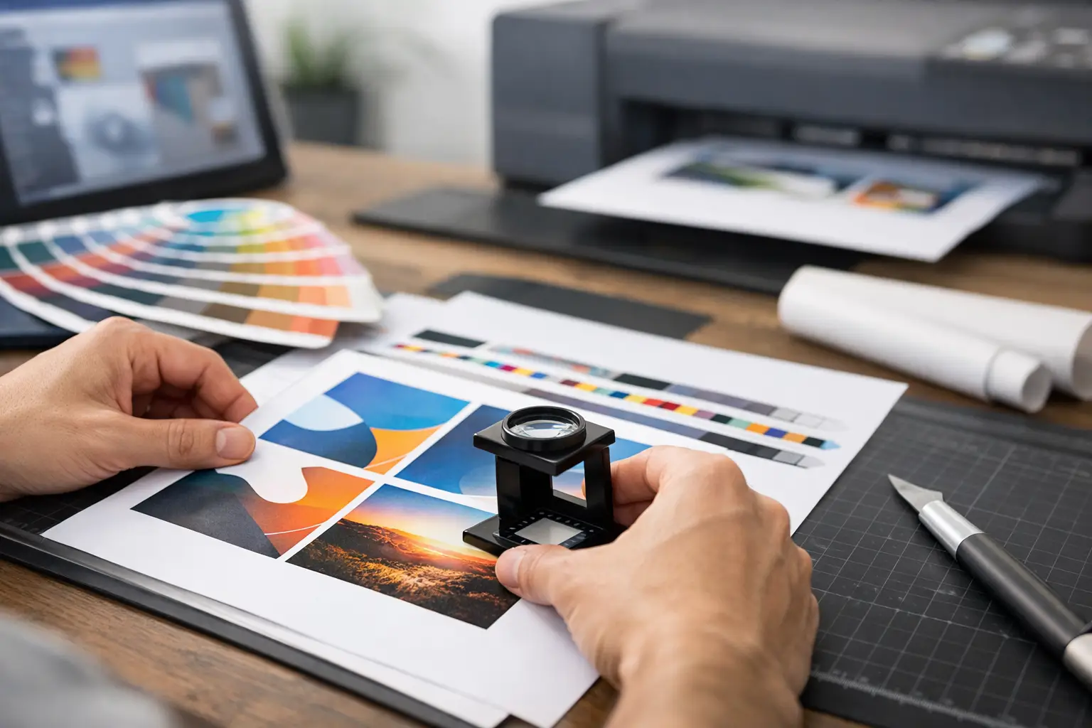
A business card that looks perfect on screen can still arrive with a white edge, blurry logo, shifted fold, or unexpected color. Knowing how to prepare print ready artwork before you place an order prevents these production issues and keeps your business cards, flyers, menus, stickers, banners, and packaging looking professional.
Print-ready artwork is not simply a finished design file. It is a file built to the exact product size, print method, material, and finishing option selected. A file for a standard matte flyer is prepared differently from a spot UV business card, die-cut sticker, roll-up banner, or embroidered uniform logo. Start with the product specification, then build the artwork around it.
Start With the Finished Size and Product Specification
Set up your document using the final trim size of the printed item. Trim size is the finished size after cutting. For example, a standard US business card is commonly 3.5 x 2 inches, while a flyer may be 8.5 x 11 inches. Do not assume that an A4 file, a social media graphic, or an old PDF is automatically suitable for the product you are ordering.
Before designing, confirm the product details: finished dimensions, orientation, single-sided or double-sided printing, paper stock or material, and any special finish. A 16 pt card with velvet lamination has different visual results from an uncoated letterhead or a PVC ID card. Large-format products also need special attention because viewing distance changes how small text, fine lines, and image detail will appear.
If you are ordering a folded brochure, menu, or presentation folder, use the supplied panel dimensions rather than dividing the page evenly by eye. Fold panels can vary slightly, especially on tri-fold products, to allow the folded piece to close cleanly. For NCR pads, invoices, certificates, and other numbered forms, leave room for sequential numbering, perforation, binding, or padding details where required.
Add Bleed, Trim Marks, and a Safe Area
Bleed is the extra artwork that extends beyond the final cut line. It gives the cutter room to trim the product without leaving an unintended white border. A standard bleed allowance is often 0.125 inch on each side, but always follow the specifications for the product selected.
If your finished flyer is 8.5 x 11 inches and the background runs to the edge, the artwork file should usually be 8.75 x 11.25 inches with bleed included. Extend background colors, photos, patterns, and borderless graphics all the way through that bleed area. Do not stop them at the trim line.
Keep essential content inside the safe area. This includes logos, phone numbers, addresses, QR codes, pricing, names, and small text. A practical rule is to keep critical elements at least 0.125 inch inside the trim line, with more space for products that are folded, drilled, stapled, or die-cut.
Thin borders close to the edge need extra care. Even correctly cut jobs can show a slightly uneven border because commercial trimming has normal production tolerance. If a border is essential to the design, make it visibly wider or move it farther inward. For many business cards and postcards, a full-bleed background without a border produces a cleaner result.
Use CMYK Color for Commercial Printing
Screens display color in RGB light. Commercial printers produce color using CMYK inks or toner. If your artwork remains in RGB, the printed result may shift, especially with bright blues, greens, neon tones, and highly saturated brand colors.
Build or convert artwork to CMYK before export. Review the color after conversion rather than assuming it will match the RGB version. A vivid electric blue on screen may print darker or less intense. This is normal because some RGB colors sit outside the printable CMYK range.
For brand-sensitive jobs, such as corporate stationery, restaurant menus, product labels, and event collateral, use approved CMYK values whenever they are available. If a specific Pantone or spot color is required, confirm whether the selected product and print process supports it. Standard full-color digital printing does not automatically reproduce every spot color as a dedicated ink.
Also check black text and black backgrounds. Small body text should generally be 100% K black for sharper reproduction. Large black areas may use a rich black build for deeper coverage, but the correct mix depends on the print process and stock. Avoid using a four-color black for fine text, as minor registration variation can make letters look soft.
Check Image Resolution Before You Upload
Low-resolution images are one of the most common causes of disappointing print. A photograph can look sharp on a laptop but become pixelated when printed because screens use far fewer pixels than print requires.
For most printed products, use images at 300 DPI at their final placed size. If a photo is 3 inches wide in your flyer layout, it should be 300 DPI at 3 inches wide, not 300 DPI at a tiny original size that has been enlarged. Enlarging a low-resolution web image does not create real detail.
Large-format banners are an exception. Because they are viewed from a distance, lower effective resolution can be acceptable depending on the final size and viewing location. A roll-up display viewed from several feet away does not need the same image density as a close-read brochure. Still, supply the best available source image and avoid screenshots, compressed messaging-app images, or images copied from social media.
Use vector artwork whenever possible for logos, icons, text, and line illustrations. Vector files remain sharp at different sizes, making them ideal for business cards, signage, stickers, apparel graphics, and branded merchandise. Common vector formats include AI, EPS, SVG, and print-quality PDF.
Prepare Fonts, Lines, and Small Details
Fonts are a frequent source of file errors. If a printer does not have the font used in your design, text can reflow or substitute incorrectly. The safest approach is to outline or convert fonts to curves in the final production file. Keep an editable working version separately because outlined text cannot be edited as normal type.
Check spelling, contact details, prices, dates, and QR codes before outlining anything. Print production can reproduce exactly what is supplied, including a wrong phone number or outdated offer. For QR codes, test the code from the exported PDF and make sure there is adequate contrast and a clear white area around it.
Avoid extremely thin lines and tiny reversed text. Fine white type on a dark background may fill in or lose clarity on certain stocks, while hairline rules can disappear. If the item will be viewed at arm’s length, such as a postcard or sticker, prioritize readability over fitting more copy into the design.
Set Up Special Finishes and Cut Shapes Correctly
Special finishes add value, but they require separate production instructions in the artwork. Spot UV, foil, embossing, debossing, white ink, and die-cutting should not be shown only as a visual effect on the main design layer. They usually need a separate named layer or spot-color mask that clearly identifies the finished area.
For example, if a business card has spot UV on the logo, supply the normal full-color card artwork plus a separate spot UV layer showing only the logo area at 100% solid color. Do not use gradients, shadows, or semi-transparent effects in the finish mask unless the product specification specifically allows them. Keep spot UV away from fold lines and critical trim areas where possible.
Die-cut stickers, shaped labels, and custom packaging need a cut path. The cut path should be a vector line on its own layer, usually set as a spot color and clearly named. Leave enough spacing between the cut line and important design elements. Complex shapes with very tight corners, tiny holes, or narrow bridges may not cut cleanly on every material.
For apparel printing and promotional products, confirm the printable area and method before finalizing the file. A detailed full-color logo may work well for sublimation or direct-to-film printing but may need simplification for embroidery, screen printing, or small-format pad printing. Fine gradients and small lettering are not equally suitable across all decoration methods.
Export a Production PDF and Review It at Full Size
A high-quality PDF is the preferred format for many commercial print jobs because it preserves layout, vector elements, and image placement. Export using a print-ready PDF preset where available, include bleed, and use crop marks only if requested. Flattening transparency may be necessary for some workflows, although current PDF standards often manage transparency correctly.
Before upload, open the final PDF and inspect every page at 100% view. Check that page count, orientation, bleed, front and back alignment, and finishing layers are correct. Zoom into logos, small text, QR codes, and images. Then view the file at a reduced size to judge the overall hierarchy and balance.
Use this final preflight check before submitting artwork:
- Finished size and orientation match the ordered product.
- Bleed extends beyond every edge where background artwork is present.
- Critical text and logos sit inside the safe area.
- Colors are CMYK, and images are high resolution at final size.
- Fonts are outlined or embedded, with spelling and contact details checked.
- Specialty finish, white ink, or die-cut layers are clearly separated.
- The exported PDF opens correctly and contains the intended pages only.
A few minutes of artwork review can prevent a full reprint, a missed event deadline, or stationery that does not match your brand. When the file, material, size, and finish are specified correctly from the start, ordering becomes faster and the final product is ready to represent your business.