

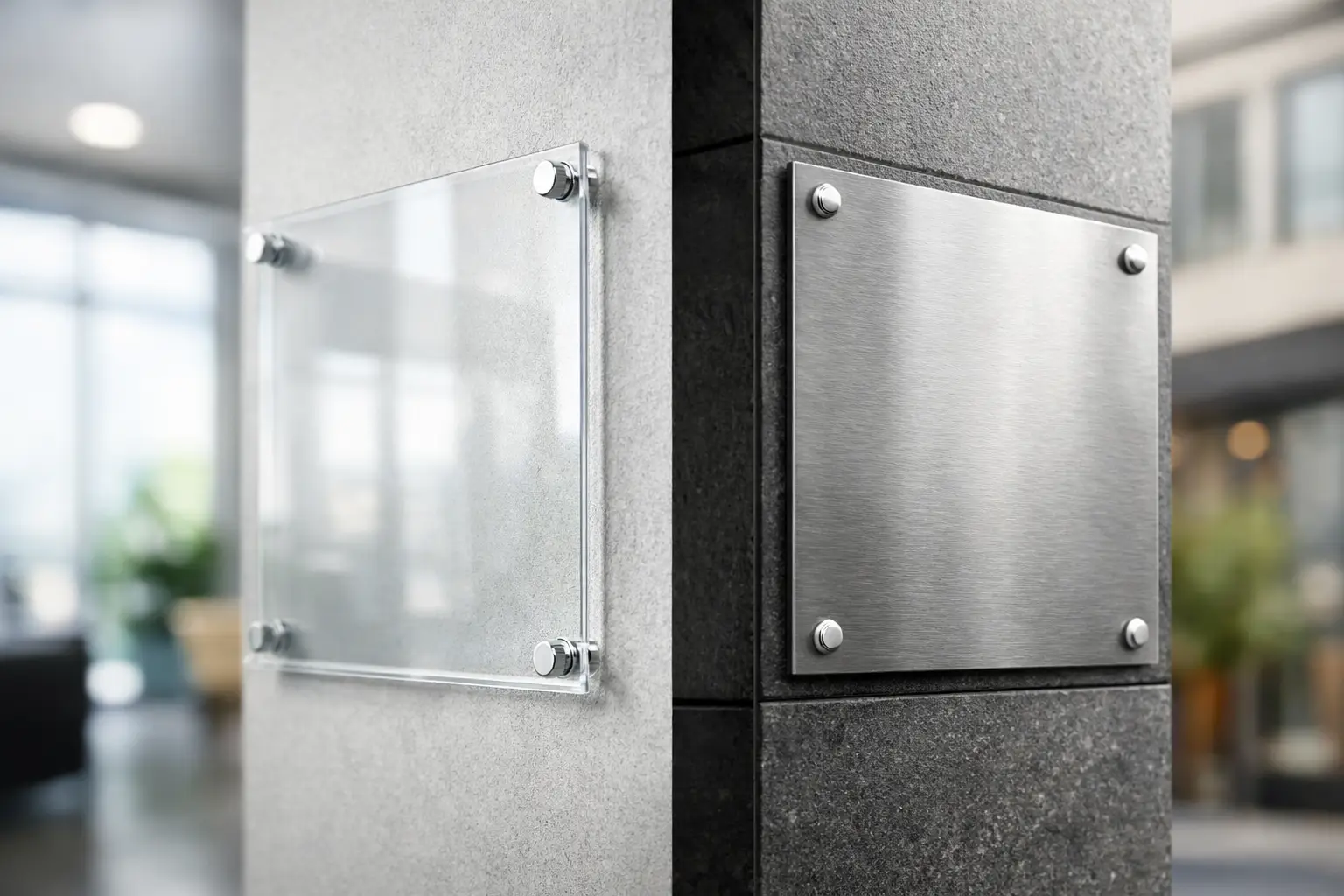
A reception sign has a different job than a parking sign. One needs a polished finish that supports a premium first impression; the other needs to stay readable through rain, sun, impact, and daily exposure. When comparing acrylic signs vs metal signs, the right choice comes down to location, expected lifespan, mounting method, and the visual standard your business needs to maintain.
Acrylic is usually selected for indoor branding, office directories, wall logos, and professional displays. Metal is often the practical choice for outdoor signs, directional panels, safety messaging, property signage, and long-term business identification. Both can carry full-color artwork, but they do not perform or present the same way.
Acrylic Signs vs Metal Signs: Key Differences
Acrylic signs are made from rigid plastic sheets, often clear, white, black, or colored. Clear acrylic can be printed on the reverse side so the design is viewed through the polished front surface. This creates depth and a clean, glass-like appearance without the weight and breakage risk of actual glass. Frosted acrylic and layered acrylic options can also give office signage a more refined finish.
Metal signs may be produced from aluminum, aluminum composite panel, steel, or other metal substrates depending on the application. For most business signage, aluminum and aluminum composite materials are common because they are light enough to mount easily while offering good outdoor performance. Metal signs are generally less about transparency and depth, and more about strength, weather resistance, and clear long-distance visibility.
The visual difference is immediate. Acrylic looks sleek and contemporary. Metal looks durable, functional, and established. A boutique salon, corporate office, clinic, or showroom may benefit from acrylic at the entrance. A restaurant parking area, construction site, warehouse, or retail storefront may need metal where exposure and durability matter more.
Appearance and Brand Presentation
Acrylic gives logos, names, and directional text a crisp presentation. Clear acrylic with standoff hardware creates a floating effect on a wall, making it well suited for reception desks, conference rooms, office entrances, and interior wayfinding. White ink can be added behind color artwork on clear material to improve opacity and color density.
For a more premium specification, acrylic can be paired with raised letters, vinyl overlays, or multiple layers. This works well when a sign is part of a broader branded environment that includes business cards, brochures, window graphics, menus, uniforms, and promotional materials. Matching brand colors across those items helps a business look organized rather than assembled from separate vendors.
Metal has its own visual advantages. Brushed aluminum, painted aluminum, and full-color printed metal panels can look clean and professional, particularly when the design is simple. Bold colors, large type, arrows, icons, and high-contrast graphics reproduce effectively. Metal is less suitable when you want a transparent sign or a delicate floating effect, but it is often better for signs that need to be noticed quickly from a distance.
Durability and Weather Exposure
For outdoor use, metal usually has the advantage. Aluminum does not rust, which makes it a practical option for exterior walls, gates, parking lots, roadside directions, and property notices. Aluminum composite panels are also widely used for outdoor business signs because their layered construction is rigid and stable.
Acrylic can be used outdoors, but the project needs the right material thickness, print method, and installation. Prolonged UV exposure, extreme temperature changes, and physical impact can affect its appearance over time. Clear acrylic can also show scratches more easily than metal, especially in busy areas where people may touch or brush against the sign.
That does not make acrylic a poor choice. It simply means acrylic performs best in protected locations such as lobbies, covered entrances, interior retail walls, counters, and office corridors. If the sign will face direct sunlight, heavy weather, or regular abuse, metal is usually the lower-risk purchasing decision.
Printing, Color, and Readability
Both materials can support full-color digital printing, but the artwork should be prepared for the substrate. Acrylic often benefits from reverse printing and a white backing layer. Without white ink behind the artwork, colors printed on clear acrylic can appear translucent, which may be desirable for certain designs but can reduce readability.
Metal signs are usually printed directly with UV inks or finished with a printed vinyl graphic and protective laminate. A laminate can add scratch resistance and help protect the printed surface from fading, moisture, and routine cleaning. For outdoor signs, use high-contrast color combinations and avoid small text. A sign may look clear on a computer screen but become difficult to read from a vehicle or sidewalk.
Keep the viewing distance in mind. Fine details and thin type may work on an acrylic door sign viewed from three feet away. The same details will not work on a metal directional sign viewed from 30 feet away. For public-facing signs, readability should take priority over decorative effects.
Mounting and Installation Requirements
Acrylic is commonly mounted with drilled holes and standoff hardware, double-sided adhesive, or brackets. Standoffs are popular because they create space between the sign and wall, improving the premium look. The wall material matters: drywall, tile, concrete, wood, glass, and metal surfaces may each require different fixings.
Metal signs can be drilled, screwed, bolted, framed, post-mounted, or attached to fences and gates. Because they are often used outdoors, metal signs should be installed with corrosion-resistant hardware and enough support to handle wind load. A larger sign is not just a larger print area – it also requires a more considered mounting plan.
Before ordering, confirm whether you need corner holes, custom hole placement, rounded corners, or no holes at all. Providing this information at the production stage avoids modification work after delivery.
Cost: Upfront Price Versus Service Life
Acrylic generally costs more than basic printed metal panels when you add thickness, clear stock, reverse printing, white ink, layered construction, or standoff hardware. The result can justify the cost for a customer-facing interior space where presentation affects trust and perceived quality.
Metal signs can offer stronger value for functional outdoor projects. If you need several parking signs, safety signs, directional panels, or site notices, metal may provide a lower cost per year of service because it is built for tougher conditions. However, price varies by material gauge, panel type, size, finishing, quantity, and installation requirements.
Do not choose based on material cost alone. A low-cost acrylic sign that needs replacing after a harsh season is not necessarily cheaper than an aluminum sign designed for long-term exterior use. Similarly, an industrial-looking metal panel may not give a premium office lobby the finish it needs.
Choose Acrylic for These Business Uses
Acrylic is a strong fit for office reception signs, indoor logo displays, room nameplates, directories, menu boards in protected interiors, retail wall branding, salon and clinic signage, and counter displays. It is especially effective where customers stand close to the sign and notice its surface quality.
Clear acrylic is useful when the wall color or texture should remain visible. White, black, and colored acrylic work well when the sign needs stronger contrast. If you want an elevated presentation, specify drilled holes and standoff mounting rather than applying the panel flat to the wall.
Choose Metal for These Business Uses
Metal is better suited to storefront panels, outdoor directional signs, parking signs, real estate signs, property rules, construction notices, loading-zone signs, warehouse identification, and external safety messaging. It is also practical for businesses that need repeat orders of the same sign format across multiple locations.
For outdoor applications, use a material and finish intended for exterior exposure. Include enough margin around the edges, use large text, and plan mounting holes so they do not interfere with key information. For safety and compliance signs, simple layouts are usually the most effective.
Prepare Your Sign Order Correctly
Start with the final installation location. Measure the available wall, window, post, or fence area and check the viewing distance before selecting the sign size. Then decide whether the sign needs to look decorative, endure weather, communicate from a distance, or do all three.
Supply artwork at the correct size with high-resolution logos and readable fonts. Convert critical text to outlines where possible, include bleed for full-coverage printed designs, and keep essential text away from drilled holes and trim edges. If your brand uses specific color values, provide the CMYK or Pantone reference so the printed result can be matched as closely as the material allows.
Seaonce customers can also coordinate sign artwork with other routine business materials, including stickers, flyers, brochures, branded apparel, packaging, and event displays. Using the same logo files, colors, and type treatments across each item makes repeat ordering easier and keeps the brand presentation consistent.
The best sign material is the one that fits the job without adding unnecessary cost or compromise. Choose acrylic when finish and interior presentation lead the decision; choose metal when exposure, strength, and long-term outdoor use lead it.