

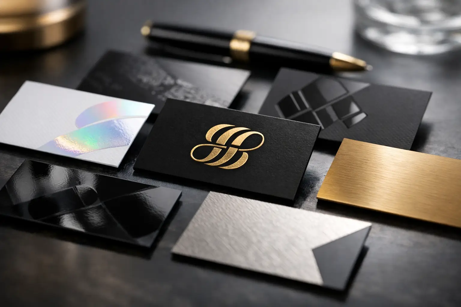
A luxury business card is judged before it is read. The weight in the hand, the texture of the surface, and the way light moves across a logo all affect whether a card feels premium or ordinary. The best finishes for luxury business cards are not simply the most decorative options. They are the finishes that suit your logo, industry, card stock, and daily use.
For a consultant, realtor, salon owner, restaurant operator, or corporate team, the right finish turns a standard contact card into a stronger brand asset. The wrong one can make small text difficult to read, add cost without impact, or show fingerprints after a few exchanges. Use the options below to specify a card that looks polished and works in the real world.
Start With the Card Stock
Finish performs best when the base material is right. A thin stock can still look attractive, but it rarely delivers the substantial feel buyers expect from a luxury card. For paper cards, 300 GSM to 400 GSM stock is a practical starting point. Thicker premium stocks, duplex cards, and multi-layer cards create more rigidity and give embossing, foil, and edge coloring a better foundation.
Design also matters. A finish should emphasize a clear element, such as a logo, business name, pattern, or title. Applying every available effect to one small card often creates visual noise. Choose one primary finish and, if needed, one secondary accent.
Best Finishes for Luxury Business Cards
1. Velvet Lamination for a Soft, Premium Touch
Velvet lamination, sometimes called soft-touch lamination, gives business cards a smooth matte surface with a soft, almost suede-like feel. It reduces glare, deepens dark colors, and immediately makes a card feel more expensive than standard gloss or uncoated paper.
This finish works especially well for black, navy, charcoal, deep green, and other solid-color designs. It suits law firms, financial services, premium retail, beauty brands, creative studios, and hospitality businesses that want restrained quality rather than a flashy look.
The trade-off is that velvet surfaces can show fingerprints or scuffing more easily than some standard laminations, particularly on very dark artwork. Keep large dark panels clean, avoid packing the card into tight holders with rough edges, and add spot UV or foil only where it supports the design. For a clean luxury result, velvet lamination with a simple raised logo is a reliable specification.
2. Spot UV for Contrast and Focus
Spot UV is a clear gloss coating applied only to selected parts of the design. On a matte or velvet laminated card, it creates visible contrast: the background stays soft and low-glare while the logo, icon, pattern, or name catches the light.
It is one of the most effective ways to make a simple layout look intentional. A black velvet card with a spot UV logo, for example, uses contrast rather than extra colors to create impact. It is also useful for subtle repeating patterns, product outlines, or a small brand mark on the back of the card.
Use spot UV selectively. Fine lines, tiny type, and crowded patterns may lose definition or look uneven. Large solid spot UV areas can also reveal scratches over time. The best approach is to give the gloss element enough space and keep critical contact information in regular print for dependable readability.
3. Embossing or Debossing for Dimension
Embossing raises a design above the surface of the card. Debossing presses it into the stock. Both add a tactile detail that recipients notice when they handle the card, making them strong choices for brands that rely on craft, quality, and personal service.
An embossed logo works well on thick uncoated stock, premium textured paper, or laminated card stock with sufficient weight. Debossing is especially effective for minimal designs, such as a centered monogram, a small wordmark, or a geometric mark with clean lines. It can look refined without relying on bright color or shine.
These finishes need simple artwork. Very small lettering, thin strokes, and densely detailed logos may not reproduce cleanly because the die needs enough area to create a clear impression. Embossing and debossing also add production steps, so they are better suited to cards where tactile branding is worth more than the lowest unit price.
4. Foil Stamping for High-Visibility Branding
Foil stamping uses a metallic or pigmented foil to create a sharp, reflective design. Gold and silver are classic luxury choices, while rose gold, copper, black, holographic, and colored foils can support more distinctive brand palettes.
Foil is ideal when you need the logo or business name to stand out quickly. A gold foil logo on a dark velvet card is a familiar premium combination because it is easy to recognize from a distance and feels formal in hand. Silver foil can give a cleaner, more modern effect, particularly with cool gray, white, navy, or black backgrounds.
The limitation is readability at small sizes. Foil should not carry every address, email, service line, and social handle. Use it for the logo, a short name, or a limited accent, then print the detailed contact information in a high-contrast ink. This keeps the card elegant and functional instead of turning it into a reflective surface with hard-to-read text.
5. Painted Edges for Thick, Premium Cards
Edge painting applies color to the exposed sides of a thick card. It is most noticeable on duplex or multi-layer cards, where the extra thickness creates a visible edge profile. A vivid red, blue, orange, or metallic edge can tie a neutral card directly to brand colors without crowding the front design.
This option is particularly useful for businesses with a minimal visual identity. A white card with black type can feel much more distinctive with a deep blue edge. A black card with a gold or copper edge can reinforce an upscale retail or hospitality position without adding foil to every panel.
Edge painting depends on stock thickness and accurate trimming. It is not the first choice for thin cards or designs that need the lowest possible cost. It is a finishing detail for businesses that want a card people notice from the side as well as the face.
6. PVC Cards for Durability and a Modern Feel
PVC business cards replace paper stock with a durable plastic material. They resist creasing, moisture, and everyday wear, making them a practical luxury option for membership programs, fitness businesses, property services, event access, salons, and brands whose cards are likely to stay in wallets for a long time.
White PVC provides a smooth, clean base for full-color printing. Frosted and transparent PVC create a more contemporary look, but they require careful artwork planning. Text and QR codes need strong contrast, and transparent sections should not sit behind essential information.
PVC feels different from a heavyweight paper card. It is less traditional and more durable, which may be exactly right for modern service brands. If your goal is warm texture, artisan character, or a paper-forward luxury experience, velvet or textured stock may be a better fit. If your goal is longevity, PVC is difficult to beat.
7. Die-Cut Shapes for a Recognizable Format
A die-cut card uses a custom shape rather than a standard rectangle. Rounded corners are the most practical version, but custom outlines, curved edges, tabs, and cutout details can make a card memorable when they connect directly to the brand.
A bakery might use a subtle arch shape. A beauty brand may choose rounded corners with a soft velvet finish. A construction, automotive, or technology business could use a clean angular cut. The key is usability: the card must still fit in a wallet, stack during distribution, and leave enough room for readable contact details.
Custom shapes add distinction, but they should not become a gimmick. Avoid narrow projections that bend, overly complex outlines that distract from the logo, or shapes that require recipients to rotate the card before they can find a phone number. A good die-cut feels deliberate at first glance and practical after the exchange.
Choose the Finish by Brand Use, Not Trend
For a formal, understated card, choose velvet lamination with embossing or a small foil logo. For a bold retail or creative brand, matte lamination with spot UV and a painted edge can deliver strong contrast. For cards used repeatedly in active environments, PVC provides the durability that paper cannot. For an established business that wants a timeless look, thick uncoated stock with debossing may be enough.
Before ordering, review your artwork at actual card size. Check that phone numbers, email addresses, website details, and QR codes remain easy to read after the finish is added. Ask whether the selected stock supports the effect you want, especially for foil, embossing, painted edges, and custom die cuts. Seaonce offers specialty options such as velvet lamination, spot UV, embossing, and PVC so buyers can match the card specification to the job instead of settling for a generic finish.
A premium card does not need to use every finishing option. Choose the one detail that makes your brand feel more credible in the hand, then let clean layout, strong stock, and readable information do the rest.