

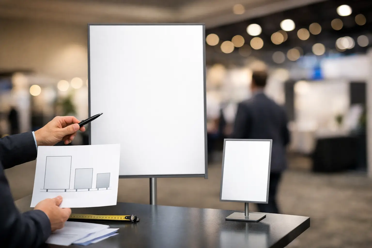
A 24 x 36-inch poster can look professional at a registration desk and disappear completely at the back of a ballroom. That is the central issue in how to choose event signage sizes: the correct size is not based on what looks good on a screen. It is based on where the sign sits, how far away people stand, what they need to do next, and how much information the sign must carry.
For event organizers, retailers, restaurants, startups, and corporate teams, signage has a job. It needs to stop foot traffic, direct guests, identify a booth, display a schedule, or reinforce a brand. Start with the sign’s job, then select the format, material, and print finish that support it.
Start With Viewing Distance, Not the Sign Format
Viewing distance is the fastest way to narrow your options. A sign read from 3 feet away can use smaller text and a compact format. A sign meant to be seen across an expo aisle or parking area needs much larger lettering and more open space.
A practical rule is to allow about 1 inch of letter height for every 10 feet of viewing distance. A headline intended to be read from 30 feet away should generally use letters around 3 inches high. This is a planning guide, not a substitute for a proof. Thin fonts, low-contrast colors, and crowded layouts may require larger type.
Think about the guest journey. A tabletop sign at a check-in counter is read at arm’s length. A directional sign near a hallway needs to work from 10 to 20 feet away. A stage backdrop or storefront-facing event banner may need to be visible from 50 feet or more. One event often needs all three.
How to Choose Event Signage Sizes by Location
Placement determines both the size and the orientation of a sign. Measure the available space before designing. A banner that fits your artwork may not fit between venue columns, behind a table, or inside a booth frame.
Registration, Check-In, and Tabletop Signs
For registration counters, product displays, reserved tables, QR codes, and payment instructions, smaller formats are usually effective. Standard letter size, 8.5 x 11 inches, works for close reading. Use 11 x 17 inches when the message needs to be visible from several feet away or when multiple guests approach the same desk.
Tabletop signage should be simple. A guest should be able to see the key action immediately: Check In Here, Scan to Register, Pickup Orders, or Reserved. If the sign includes a QR code, leave clear space around it and test scanning at the actual intended distance. An oversized sign will not fix a code that is too small, poorly placed, or printed with weak contrast.
Directional Signs and Room Identification
Directional signs need enough visual weight to be spotted while people are moving. A 12 x 18-inch or 18 x 24-inch sign is often suitable for a door, corridor, elevator area, or stand. For wider hallways and busy venues, 24 x 36 inches gives arrows, room names, and sponsor branding more room without making the layout crowded.
Use portrait orientation for door notices and vertical wayfinding. Use landscape orientation when listing multiple destinations or placing a large arrow across the sign. Keep the number of directions limited. A large sign packed with ten destinations is harder to use than several well-placed signs at decision points.
Booth Signs and Pop-Up Displays
At trade shows, the main booth sign must compete with surrounding displays. A small poster behind a six-foot table rarely has enough presence. For basic branding, a 24 x 36-inch rigid sign or poster can work at the side of a booth. For a primary message behind staff, step up to a 36 x 48-inch sign, a large banner, or a roll-up display.
A common roll-up banner size is approximately 33 x 79 inches. Its vertical format is useful when floor space is limited and the message needs to be visible above a table. Keep the logo and main headline in the upper half. Product details, contact information, and calls to action can sit lower, but do not place essential copy where a table, boxes, or visitors may block it.
For larger booths, use a hierarchy: one big brand message visible from the aisle, then smaller signs for product features, pricing, demonstrations, or promotions. Trying to make every sign perform every job increases production cost and weakens visibility.
Stage Backdrops and Photo Areas
Stage signage must be sized to the room and camera frame, not just the stage wall. A banner that looks large in an empty venue can appear undersized once speakers, furniture, lighting, and guests are in front of it.
For a small presentation area, a 4 x 6-foot banner may be sufficient. Larger conferences, award events, and photo backdrops often need 8 x 8 feet, 8 x 10 feet, or wider. If photos are part of the event plan, repeat logos with enough spacing that they remain visible behind people. Small logos and fine sponsor lines usually disappear in event photography.
Confirm whether the venue allows hanging signs, wall adhesive, grommets, or freestanding displays. A large banner is only useful if you have a safe, approved method to install it.
Outdoor Entrances, Parking, and High-Traffic Areas
Outdoor signs need more size than indoor signs because people view them from farther away and under changing light conditions. Wind, sun, rain, and vehicle traffic also affect material choice.
A 2 x 4-foot banner may work at a pedestrian entrance. For roadside visibility, parking directions, or a large building frontage, 3 x 6 feet, 4 x 8 feet, or custom dimensions may be more appropriate. Use bold colors, thick fonts, and short messages. Drivers do not have time to read event descriptions.
Vinyl banners are a practical choice for temporary outdoor promotion. Add grommets or pole pockets based on the installation method, and allow for a clear border so mounting hardware does not cover important artwork. For rigid outdoor signs, select a substrate suitable for the expected duration and weather conditions.
Match the Sign Size to the Message
The more words a sign contains, the larger it needs to be. This sounds obvious, but many event files are designed as if guests will stand still and read every line. Most will not.
Use one primary message per sign. For example, an entrance banner can carry the event name, date, and a simple welcome message. A schedule board can carry time blocks and room names. A product sign can carry a product name, price, and one benefit. When a sign needs detailed schedules, menus, or sponsor information, choose a larger format or split the content across multiple signs.
White space is a production requirement, not wasted space. It gives large text room to work and helps logos, arrows, QR codes, and calls to action remain clear at a glance.
Select Material After You Set the Size
Size affects handling, but material affects performance. Paper posters are cost-effective for short indoor use and can work well in frames or mounted displays. Foam board, PVC, and other rigid sign materials are better for freestanding displays, easels, and repeated handling. Vinyl banners are suited to large-format indoor or outdoor installation, while roll-up displays provide a portable, reusable option for exhibitions and presentations.
Consider transport early. A 24 x 36-inch rigid board is easy to place on an easel, but several large boards may require a vehicle with flat cargo space. A roll-up display packs into a carry bag. A banner can be rolled for delivery and storage. The lowest unit price is not always the lowest event cost if the sign is difficult to install, replace, or move.
For premium indoor branding, finishing can also influence the result. Matte surfaces reduce glare under venue lighting. Lamination can add protection for signs handled repeatedly. Gloss finishes make colors stand out but may reflect spotlights, especially on schedule boards and photo-area graphics.
Check the Venue Before Ordering
Ask for the venue’s event kit or signage rules before finalizing sizes. Confirm booth dimensions, table sizes, approved mounting methods, fire-rating requirements, loading access, and sign placement restrictions. Hotels and convention centers may limit floor signs, wall mounting, hanging displays, or materials that block emergency routes.
Also check sightlines. A sign placed behind an open door, a tall floral arrangement, or a registration queue will not perform as planned. If possible, mark the intended location with painter’s tape or a paper mockup. This quick check often reveals whether an 18 x 24-inch sign is enough or whether you need to move up to 24 x 36 inches.
Build a Signage Plan, Not a Single Sign Order
The strongest event setups use sizes consistently. Choose a primary format for close-up information, a mid-size format for direction and promotion, and one large format for brand visibility. This creates a recognizable system and makes reordering easier for recurring events.
For example, a local business launch might use 8.5 x 11-inch counter signs, 18 x 24-inch directional signs, two 24 x 36-inch product boards, and a roll-up banner at the entrance. A larger conference may add room signs, schedule boards, sponsor backdrops, and outdoor wayfinding banners. The right mix depends on venue scale and attendee flow, not on ordering the biggest size available.
Before sending artwork to print, review every sign at its final dimensions. Check logo size, text contrast, safe margins, image resolution, and the exact installation method. Seaonce customers can keep routine event materials, large-format signage, branded apparel, and giveaways within one purchasing workflow, which helps maintain a consistent brand presentation across the venue.
A sign earns its space when people can see it, understand it, and act on it without stopping to decode the layout. Choose the size that makes that happen, then let the event move.