

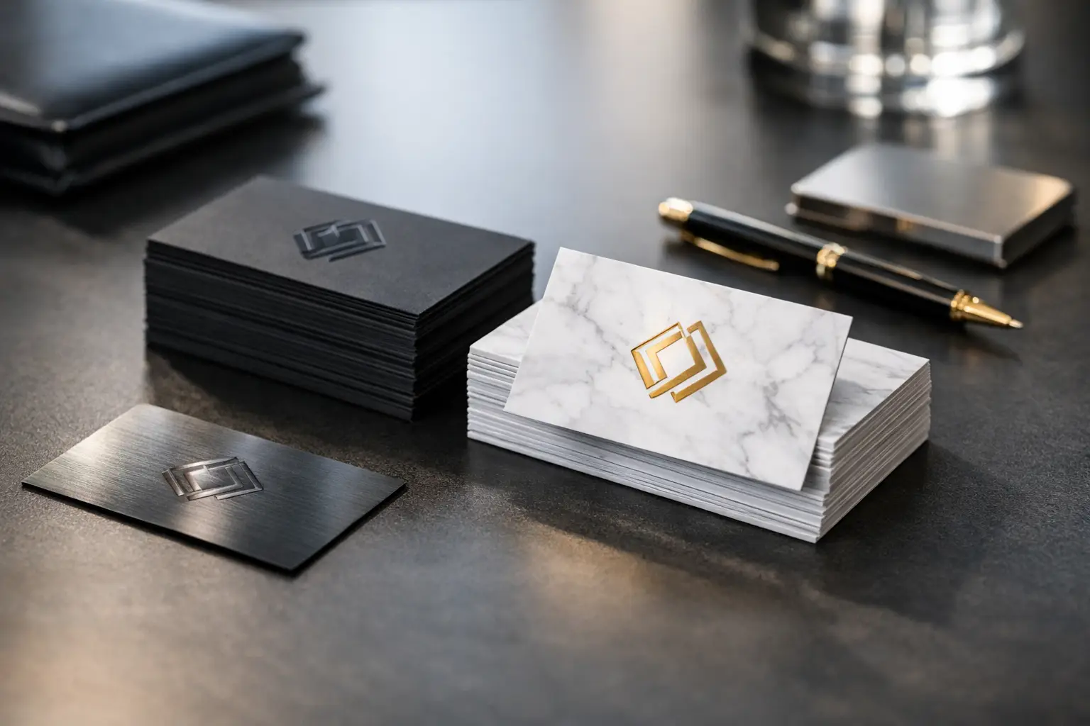
A business card is often handled when a customer, supplier, or prospect has only a few seconds to form an opinion about your company. Learning how to design premium business cards means making those seconds count with clear information, strong branding, and materials that feel worth keeping. Premium does not always mean adding every available finish. It means choosing the right paper, layout, and production details for the way your business sells.
A real estate agent may benefit from a heavy soft-touch card with a spot UV logo. A contractor may need an uncoated stock that is easy to write on. A restaurant owner may prefer a compact card that also works as a reservation reminder or loyalty card. Start with the job the card needs to do, then build the design around it.
How to Design Premium Business Cards for Your Brand
Before selecting paper stock or effects, define the single message your card should deliver. Usually, that message is your name, your business, and the easiest next action: call, email, visit, scan, or book. If every service, social profile, and promotional offer is competing for space, the card will look crowded regardless of how premium the finish is.
Use your existing logo, brand colors, and typefaces where possible. Business cards should match your storefront, menu, website, uniforms, packaging, and signage. Consistency makes a small business look established. If your logo has fine lines or very small text, test it at actual card size before approving production. Artwork that looks sharp on a large screen can lose detail when reduced to 3.5 x 2 inches.
Keep the front focused. A logo, business name, short descriptor, and one strong visual element are often enough. The back can carry contact details, a service list, appointment information, a QR code, or a promotion. This front-and-back approach gives the design breathing room and prevents the common mistake of shrinking everything to fit one side.
Choose a size that supports the design
The standard US business card size is 3.5 x 2 inches because it fits wallets, card holders, and common display racks. It is the practical option for most professional services, retail businesses, and corporate teams. A standard size also makes reordering simple and helps control cost.
Special sizes can create a stronger first impression, but they should have a purpose. Square cards suit design-led brands, salons, boutiques, and creative studios. Slim cards can work well for hospitality, events, or upscale retail. Vertical cards are useful when your logo or packaging already uses a tall format. Keep in mind that unusual dimensions may be harder for customers to store, and a premium card that gets discarded is not a premium result.
Select Paper Stock Before Choosing Effects
Paper stock changes how a card feels in the hand, how colors reproduce, and whether it can be written on. Do not treat it as an afterthought. The finish should support both your design and your daily use.
A 14 pt or 16 pt coated card stock is a dependable choice for full-color cards with photos, gradients, and bold graphics. It provides a professional weight without being overly expensive. For businesses that distribute cards frequently at events, counters, or job sites, this is often the best balance of appearance and volume cost.
For a more substantial impression, choose a thicker stock or layered card construction. Heavy cards communicate permanence and quality, particularly for consultants, luxury services, corporate executives, architects, and premium retail brands. However, thickness alone does not fix a weak layout. A thick card with tiny text and poor contrast still feels difficult to use.
Uncoated stock has a more natural, tactile surface and is a practical choice when people need to write appointment dates, notes, or order details on the card. It works especially well for clinics, home services, restaurants, and professional offices. Color tends to look softer on uncoated paper than on glossy coated stock, so avoid relying on very subtle color differences.
PVC business cards are a strong option for membership cards, loyalty programs, staff ID cards, and reusable appointment cards. They are durable, water-resistant, and closer in feel to a bank card than a paper card. For a business that wants customers to keep the card for months, PVC can offer better value than a paper card with multiple decorative upgrades.
Use Finishes With a Clear Purpose
Special finishes make premium business cards more noticeable, but each one has a visual and cost trade-off. Choose one main effect unless the design genuinely needs more.
Velvet lamination, also called soft-touch lamination, gives the card a smooth, matte surface with a soft feel. It is ideal for minimal designs, dark backgrounds, and brands that want a refined appearance. It can show fingerprints more readily on deep black or solid dark colors, so use it with a design that accounts for handling.
Gloss lamination makes colors appear brighter and can add protection against scuffs and moisture. It suits colorful retail, entertainment, food, beauty, and promotional designs. Because the surface reflects light, small text and QR codes need strong contrast to remain easy to read.
Spot UV applies a high-gloss raised-looking effect to selected areas, such as a logo, icon, product image, or business name. It creates contrast against a matte or velvet-laminated background. Use spot UV to direct attention, not to cover every element. A logo in spot UV on a clean black card is usually more effective than a page full of shiny text.
Embossing or debossing physically raises or presses an area of the card. These finishes work best with simple marks, bold lettering, or monograms. Fine details may not reproduce well, and the effect can be lost if it is competing with complicated graphics. Foil can add a metallic accent, but it should be used carefully to preserve legibility.
Build a Layout That Can Be Read at a Glance
A premium card is easy to scan. Place the most important information where the eye naturally lands, and use spacing as part of the design. Empty space is not wasted space. It helps your logo, name, and contact details appear more confident.
For most cards, include your name, job title or role, company name, phone number, email address, and website or location if relevant. A QR code can be useful when it leads to a booking page, menu, portfolio, review page, or digital contact card. Do not add one just because it is available. If the destination is generic or not mobile-friendly, it adds clutter without helping the customer.
Use no more than two typefaces. Make the name and company identity visually stronger than the supporting details. Avoid fonts that are too thin, decorative, or condensed at small sizes. A readable typeface at a sensible size will look more expensive than a fashionable font that forces the recipient to squint.
Color contrast matters as much as typography. Light gray text on white, dark text over a busy photo, and metallic effects on similar colors can reduce readability. Print is physical, not backlit. Review the design at 100% size on screen and, when possible, print a basic paper proof before ordering specialty finishes.
Use both sides strategically
The back of the card should earn its place. For a service business, it can show three core services or a concise call to action. For a retailer, it can contain a discount code, store hours, or loyalty details. For event professionals, it can include a QR code linked to registration or a portfolio.
Avoid turning the reverse side into a miniature brochure. If your business needs a long list of services, use a flyer, brochure, or postcard for that information. The business card should open the conversation and make follow-up easy.
Set Up Print Files Correctly
Good design can be weakened by poor file setup. Submit press-ready artwork whenever possible, using the printer’s required template and specifications. Most business card printing requires a 0.125-inch bleed on all sides so background colors and images extend beyond the final trim line. Keep text, logos, and QR codes inside the safe area rather than close to the edge.
Use CMYK color mode for print files. RGB colors are designed for screens and can shift during printing, especially bright blues, greens, and neon shades. Supply logos as vector artwork when available, such as AI, EPS, SVG, or print-ready PDF files. Vector graphics stay sharp at any size, while low-resolution images can look soft or pixelated.
Before placing the order, check these production details:
- Confirm the final size, orientation, quantity, and whether printing is one-sided or two-sided.
- Verify names, phone numbers, email addresses, URLs, and QR code destinations character by character.
- Check that images are high resolution and that black text is set for clean, readable printing.
- Review bleed, safe margins, finish placement, and any separate spot UV or embossing artwork layers.
If you are ordering cards for multiple employees, use one approved master layout. Only change names, roles, direct numbers, and email addresses. This keeps the team presentation consistent and reduces costly reprint errors.
Spend Where Customers Can Feel the Difference
Not every business needs embossed foil, thick layered stock, and spot UV. A café handing out hundreds of cards each month may get better results from a clean 16 pt card with gloss lamination. A financial advisor who meets a smaller number of high-value prospects may justify velvet lamination and selective spot UV. The right specification depends on distribution volume, customer value, and how long the card needs to stay in use.
If budget is limited, prioritize a clean layout, readable contact information, quality stock, and accurate color before adding decorative effects. Those fundamentals create trust. Specialty finishes should reinforce a clear brand, not compensate for an unfinished design.
A premium business card should make the next step simple. When the stock feels right, the details are easy to read, and the card reflects the quality of your service, recipients are more likely to keep it, remember it, and use it when they are ready to buy.