

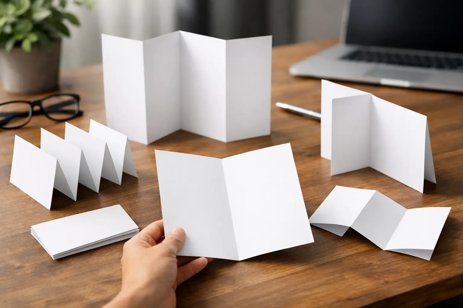
A brochure can have the right logo, colors, and offer but still fail if the reader cannot find the key information quickly. When deciding how to select brochure folds, start with the order in which your customer needs to see the message. The fold controls the reading path, panel size, mailing format, and the amount of content that can fit without making the design feel crowded.
For a restaurant menu, a service price list, an event schedule, or a product handout, the best fold is usually the one that matches the job of the brochure. A compact fold may be ideal for a counter display. A larger multi-panel format may work better for detailed services, maps, or product categories.
Start With the Brochure’s Purpose
Before choosing a fold, identify what the printed piece must accomplish. A brochure that introduces three core services needs a different layout from one that lists 20 products or explains a multi-step process.
For a promotional handout, the front panel should create interest immediately. Use it for a headline, product image, event name, or limited-time offer. The inside panels can carry supporting details, while the back panel typically holds contact information, a QR code, business hours, social handles, or a call to action.
If the brochure is primarily informational, such as a clinic service guide, school program, real estate listing, or travel itinerary, choose a fold that allows readers to move through the content in a logical sequence. Do not select a complex fold just because it looks different. More folds create more panels, but they also create more design decisions and more places for the message to get lost.
How to Select Brochure Folds by Content Volume
The amount and type of content should guide the fold choice. Think in panels rather than pages. Each panel needs a clear role, enough white space, and margins that keep text away from fold lines.
Half Fold for Simple, High-Impact Information
A half fold creates four pages: a front cover, two inside pages, and a back cover. It is a practical choice for company profiles, event programs, product launches, short menus, and simple service promotions.
This format gives large areas for photography, bold graphics, and readable text. It is useful when your message does not need multiple categories or a long list of specifications. A half fold can be printed vertically or horizontally, depending on whether you need a tall cover or a wider interior spread.
Choose a half fold when clarity matters more than quantity. If you try to place a full catalog, detailed rate card, and long company history into four pages, the brochure will feel overloaded.
Tri-Fold for Services, Menus, and Direct Mail
A tri-fold is one of the most common business brochure formats because it creates six panels in a compact size. It works well for salons, restaurants, clinics, retail stores, local service companies, insurance agents, and event organizers.
The outer panels usually include the cover, back panel, and fold-in panel. The interior panels provide room to organize services, menu sections, package options, benefits, or a step-by-step process. A tri-fold also fits easily into standard envelopes, brochure racks, and direct-mail campaigns.
Use a tri-fold when you have three to five related content sections. For example, a home services company can dedicate inside panels to repair, installation, maintenance plans, and why customers choose the business. A restaurant can separate appetizers, main dishes, beverages, and contact details without needing a full booklet.
Keep in mind that the folded-in panel is normally made slightly narrower so it closes properly. Your artwork should use the correct panel measurements from the print specification rather than dividing the sheet into three identical columns.
Z-Fold for Sequential Messages
A Z-fold creates panels that fold back and forth like an accordion. When opened, it creates a continuous horizontal layout, which is useful for timelines, maps, process explanations, comparison charts, and event schedules.
Unlike a standard tri-fold, each panel in a Z-fold is generally the same width. That can make layout planning more straightforward, especially when each section carries a similar amount of information. It is a strong choice for businesses that want to present a sequence: problem, solution, process, result, and contact.
A Z-fold is less suitable when the inside needs to feel like one large uninterrupted image. The fold lines will break up photography and graphics. Use it when the content naturally divides into distinct steps or sections.
Gate Fold for Premium Reveals
A gate fold has two outer panels that fold inward and meet at the center. Opening the panels reveals a larger inside spread. This format is often used for product launches, premium invitations, property presentations, luxury retail promotions, and corporate announcements.
The closed panels create anticipation, while the inside spread gives space for a strong image, offer, or key presentation message. Because a gate fold requires more precise finishing and design setup, it is usually better for high-value campaigns than routine bulk handouts.
Avoid placing small text or critical design elements directly where the gate panels meet. The center closure can shift slightly during folding, and a crowded design will make that normal variation more visible.
Double Parallel Fold for Detailed Offers
A double parallel fold is folded in half twice, producing narrow panels and a compact finished piece. It is useful for detailed service guides, large menus, product lists, informational handouts, and mailers that need more room than a standard tri-fold.
This fold gives you additional panels without moving to a stapled booklet. However, it also requires careful content organization. Readers may open the brochure in different ways, so headings, panel labels, and visual cues should make the structure easy to understand.
Match the Fold to Distribution and Display
Where the brochure will be used affects the right format. A brochure handed out at a trade show needs to fit comfortably in a bag or pocket. A restaurant menu must withstand repeated handling. A real estate or corporate presentation may need a more substantial feel.
For direct mail, choose a folded size that fits your envelope or mailing plan. For counter displays and brochure holders, confirm the finished dimensions before ordering. A fold that looks good on screen may be too wide, too tall, or too thick for the display rack you plan to use.
If staff will carry brochures during sales calls, consider a compact tri-fold or Z-fold. If customers need to compare packages or read pricing at length, a larger half fold or double parallel format can provide better readability.
Choose Paper Stock and Finish With the Fold in Mind
Paper weight and finish affect both appearance and folding performance. Lightweight paper folds easily and is cost-effective for high-volume promotions. Heavier stock gives a more substantial feel but may crack along the fold if it is not properly scored.
For most business brochures, a 100 lb text stock provides a practical balance of durability and flexibility. Heavier cover stock can work for premium pieces, invitations, and short-run presentations, but ask for scoring when the stock is thick or when using coated paper.
Gloss coating makes photos and bright colors stand out, making it suitable for food images, retail offers, travel promotions, and product brochures. Matte finishes reduce glare and create a more reserved, professional look for corporate services, education, health care, and financial materials. Velvet lamination can add a soft premium finish, while spot UV is best used selectively on logos, product names, or key design details.
Do not add heavy ink coverage across a fold line without considering the finish. Dark solid colors, full-bleed photos, and laminated surfaces can show stress at the crease if the piece is folded incorrectly or not scored. A print-ready file should account for safe margins, bleed, and fold positions from the beginning.
Plan Each Panel Before Designing
A fold is not an afterthought added after the artwork is complete. Build the content around the panel structure first. Mark the cover, back panel, fold-in panel, and inside sections before placing text and images.
A useful brochure usually follows a simple pattern: the cover earns attention, the interior explains the offer, and the back panel tells the customer what to do next. Keep phone numbers, addresses, website details, and QR codes easy to find. If the brochure includes pricing, service packages, or a menu, use clear headings and enough spacing for fast scanning.
Avoid placing small body text, borders, or faces directly on fold lines. Keep essential content within the safe area, and allow bleed only for background colors and images that extend to the edge. Review the brochure as a folded object, not just as a flat digital file.
The right fold makes your offer easier to read, easier to carry, and easier to act on. Select the layout that gives every message a clear panel, then choose the paper and finish that support the way customers will handle it.